All Aboard
Conference identity that builds cohesion for a distributed regional firm to advance their mutual business goals.
A regional professional services firm hosted their annual conference that encouraged staff to network while leadership presented long-term strategic goals. Their goal was to break down branch office silos and encourage staff to collaborate to achieve common goals.
As a designer on the creative marketing team responsible for crafting the identity, our design goal was to engage staff by creating vibrant visuals — a new look to reinforce a new cultural direction — so that leadership’s messaging would make a lasting impression. We played off of each local office’s pride in their work to create stamp logos and build a modern rail ticket inspired brand to inspire the idea of a travel network that bridges each community.
Our branding extended throughout the event's lifecycle. We created:
- A lead-up campaign to generate buzz and get staff excited for the event
- On the floor visual collateral to make the event bright, colorful, and fun
- Bespoke follow-up material to reinforce messaging year-round
Pre-Event
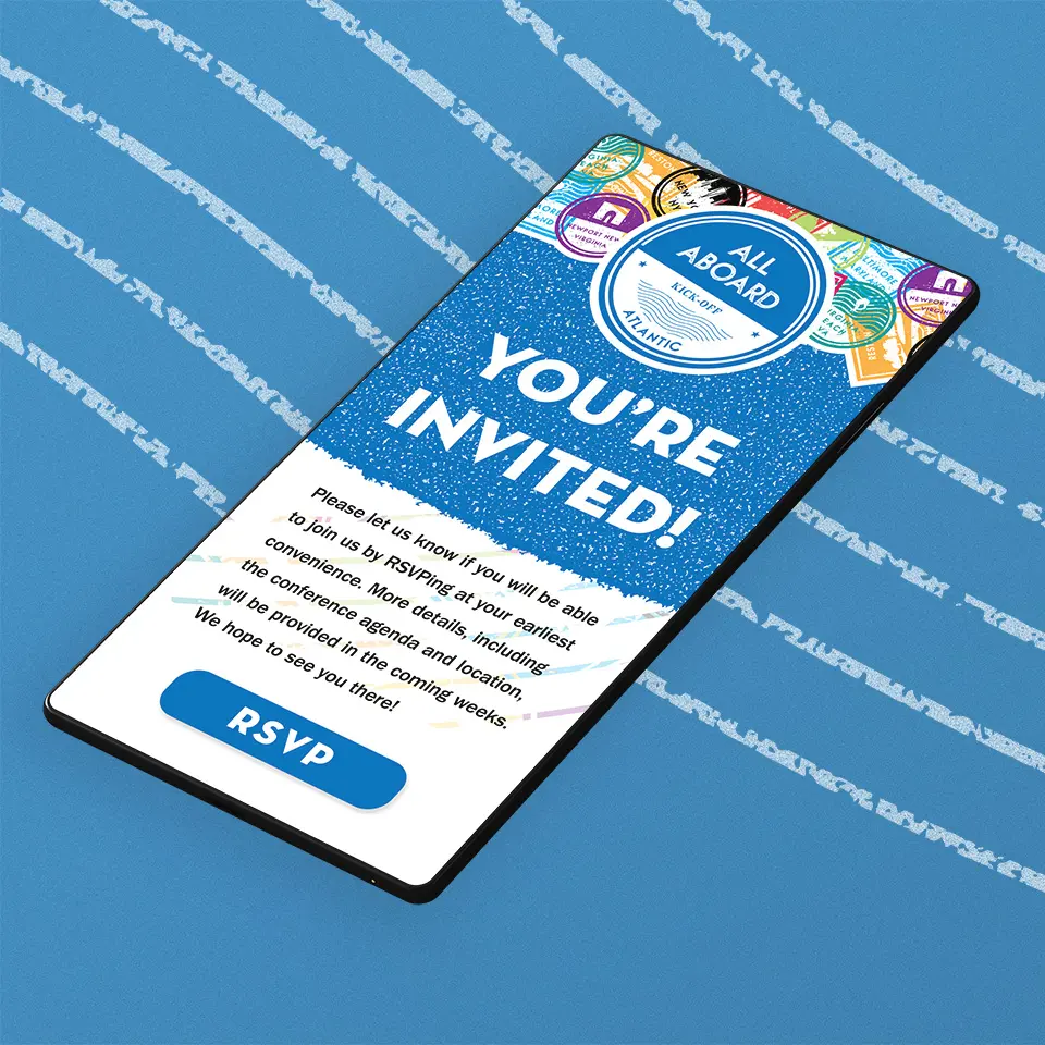
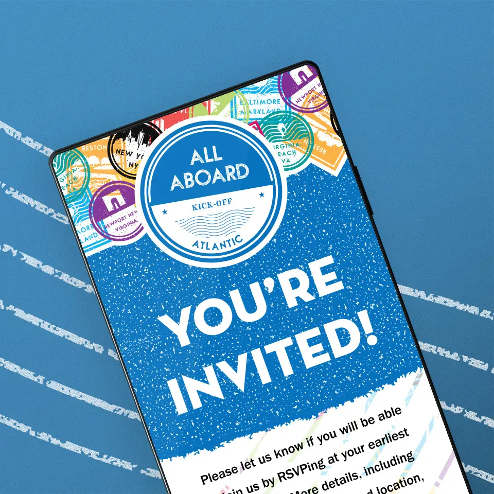
We created dynamic digital collateral for the firm’s intranet to generate excitement with bold, bright visuals and motion graphics to raise awareness on the projects performed by all branch offices.
We introduced the stamp graphic elements with project showcases, where staff could see what each regional office has been up to, and reflect on how those skills could enhance the work that their teams were doing.
Event Floor
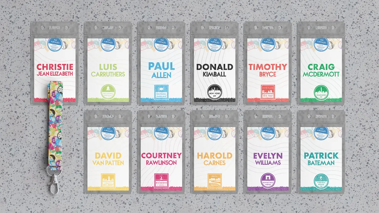
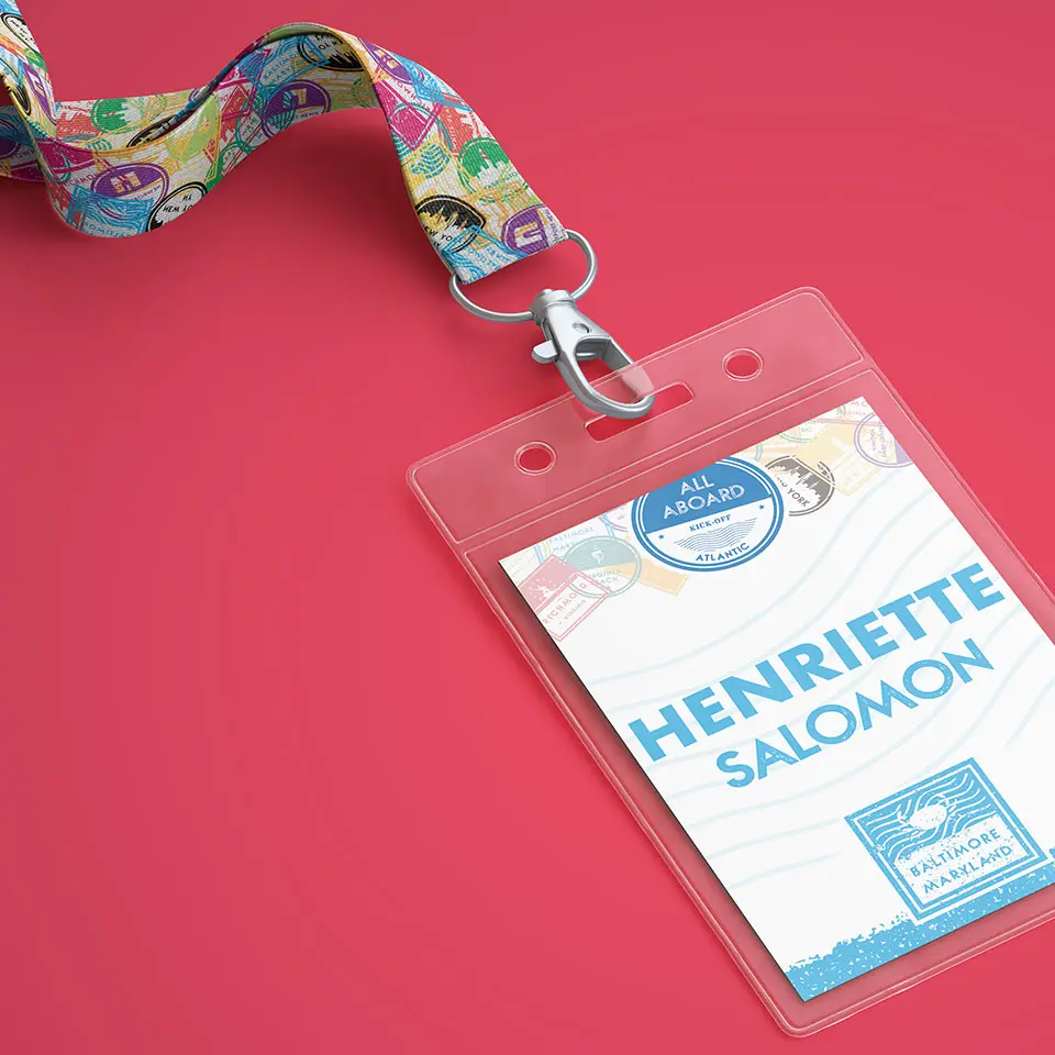
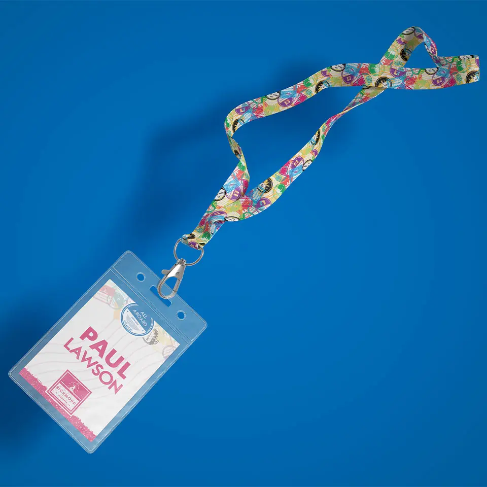
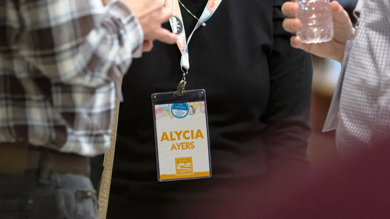
We designed name tags for all staff members which needed to be eye-catching and easy to read at a passing glance while also reflecting the unique character of each local office. We used a clean, bold stylized typeface in all caps that used the office color, while uniting the brand through identical header treatments.
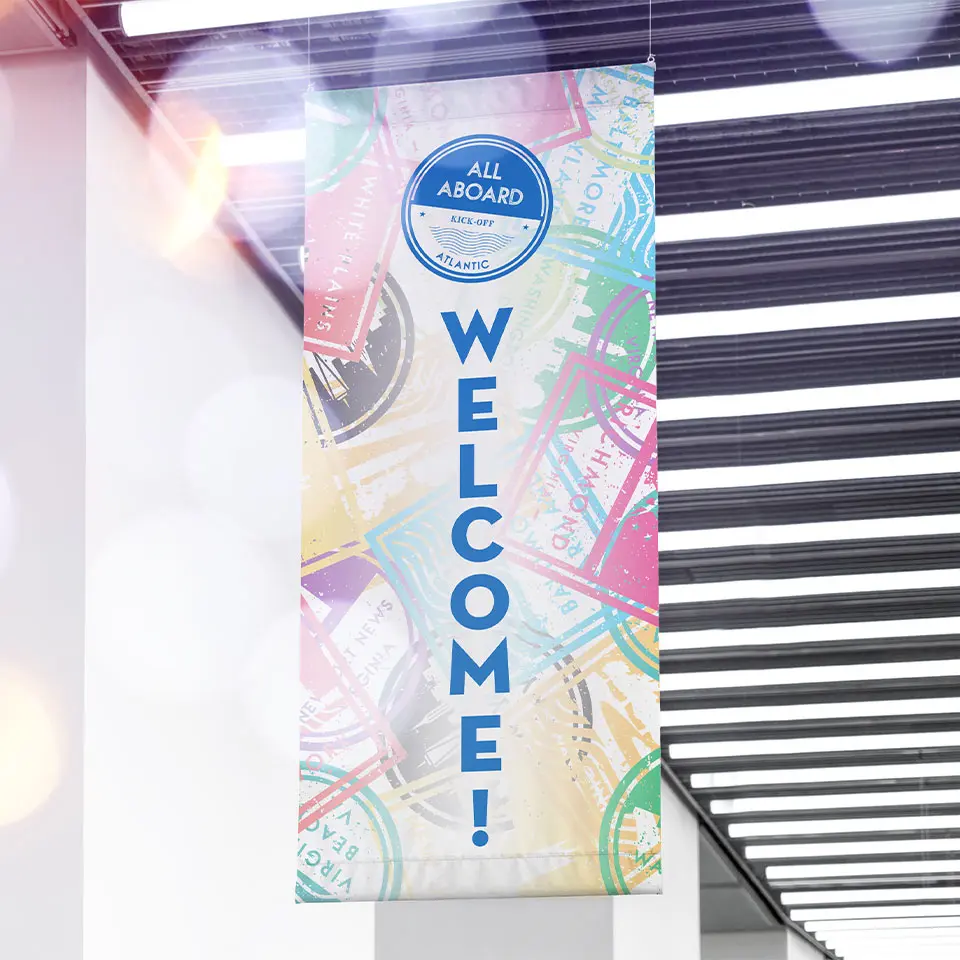
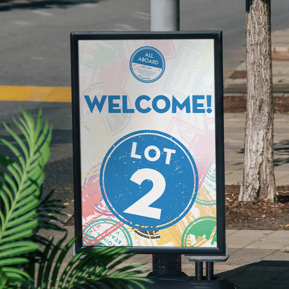
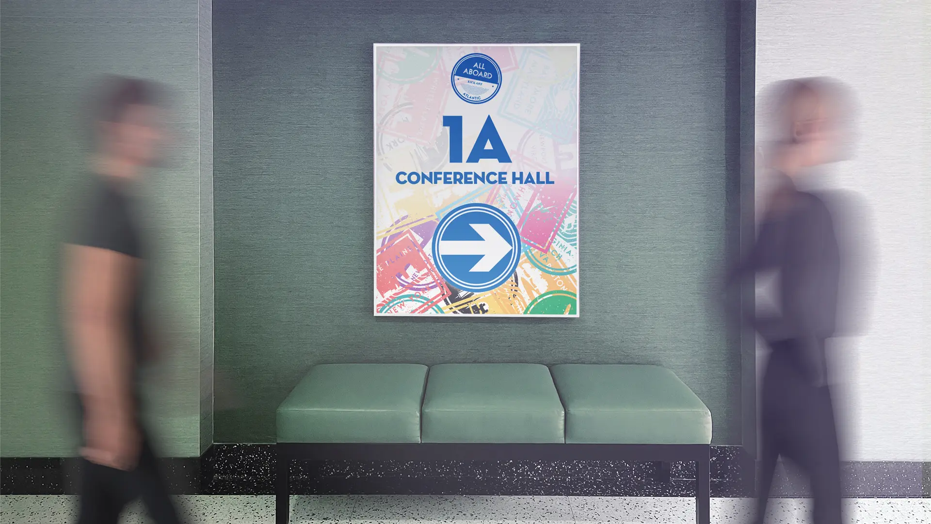
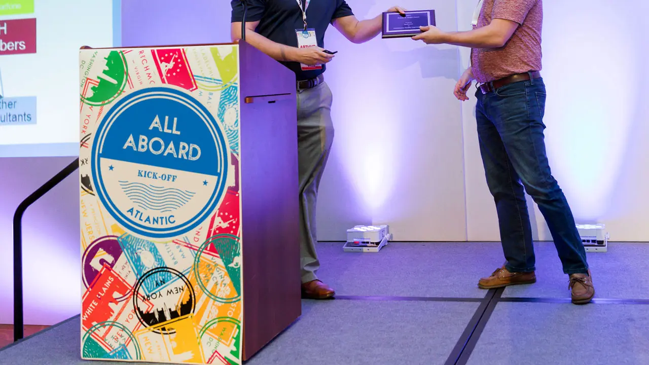
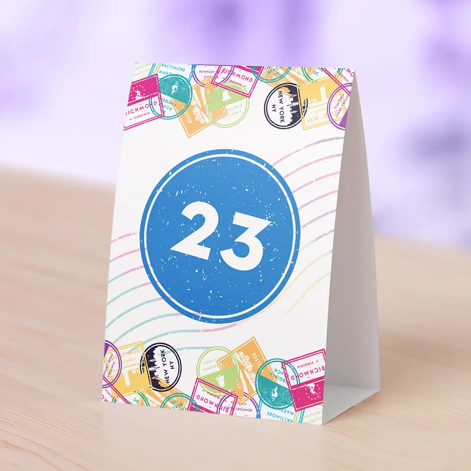
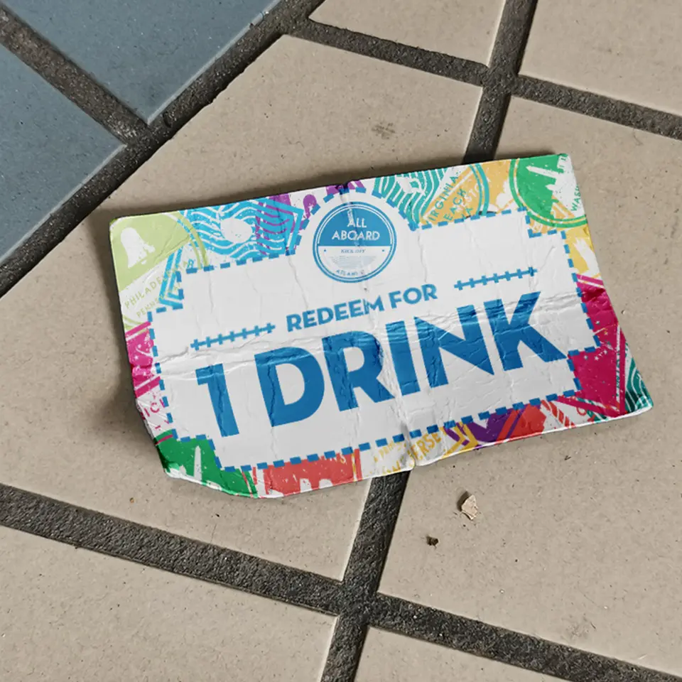
Next, we created small touches for the hotel venue space that created a professional atmosphere through cohesive branding. This included a large-scale podium graphic, table numbers, signage, and other small touches that tied the conference brand together.
Follow-Up
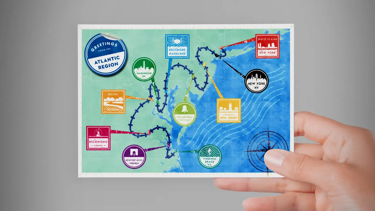
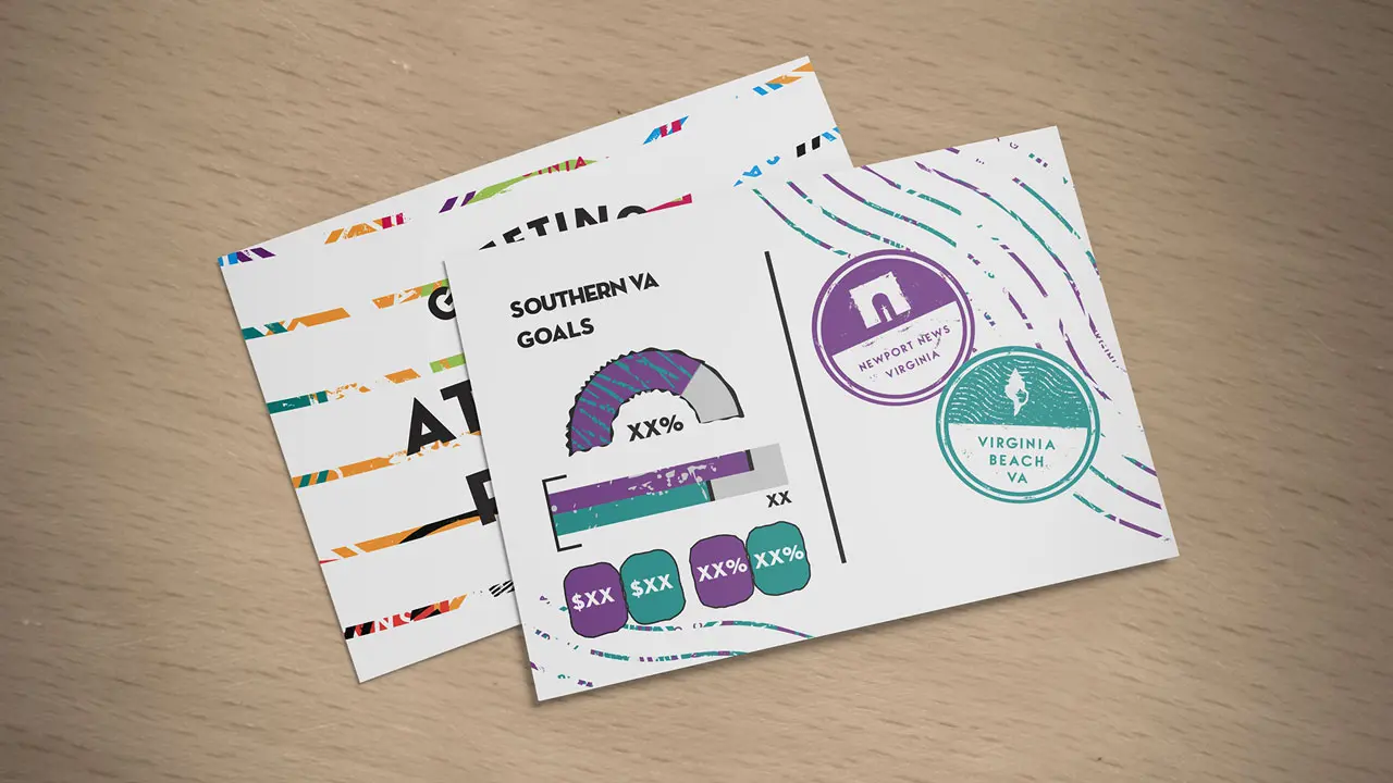
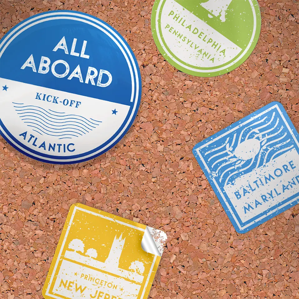
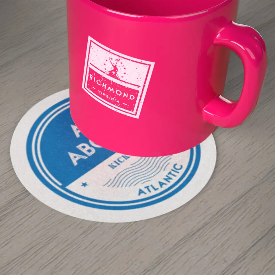
After the conference event, we created bespoke, one-of-a-kind pieces that reinforced leadership’s messaging to spark collaboration amongst offices.
We designed physical, mailed postcards that included key performance metrics on a dashboard for offices to benchmark their progress in achieving their goals. The physical postcard created a memorable personalized touch, and the concise dashboard was more intuitive and engaging than a traditional financial report. Other small touches, like stickers and mugs, bring the brand to life around each office in day-to-day use.
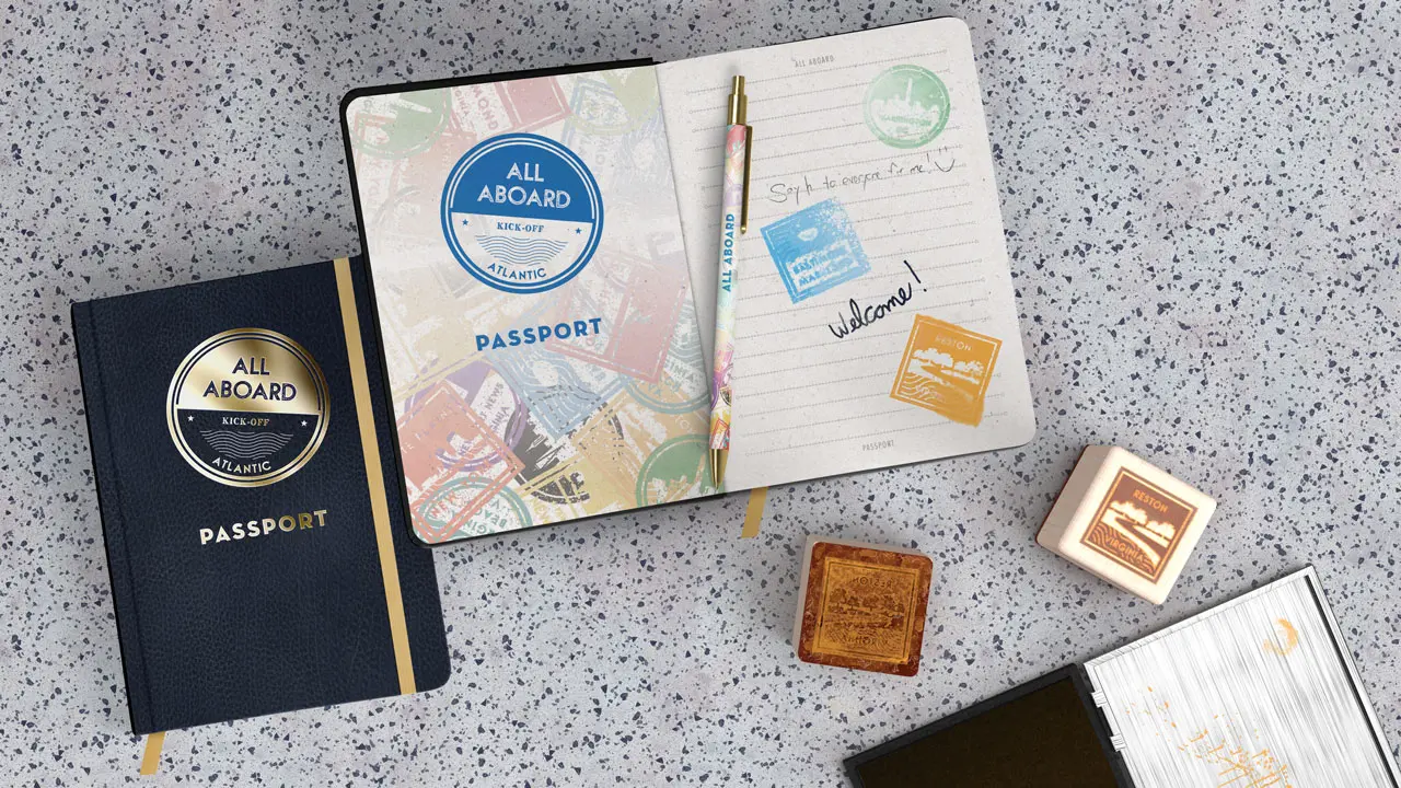
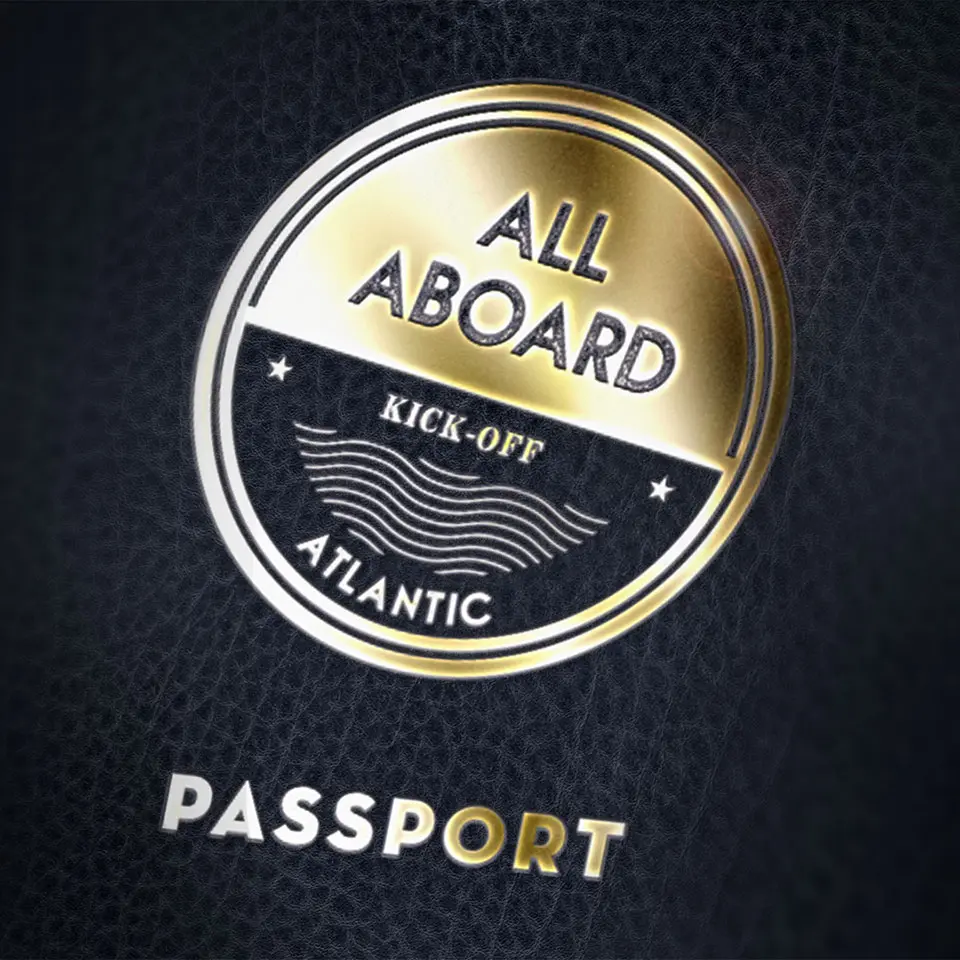
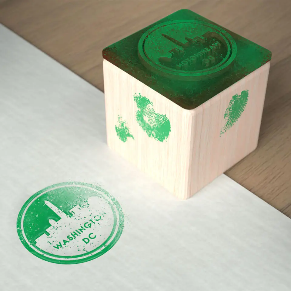
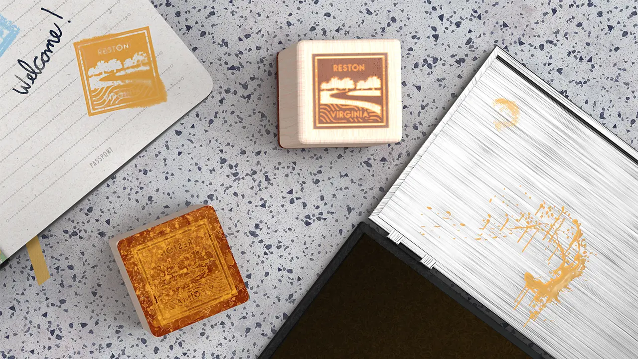
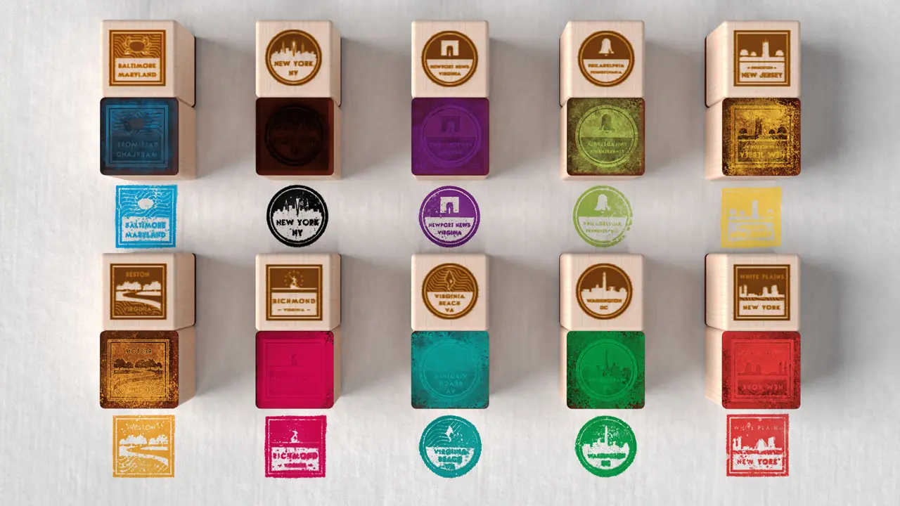
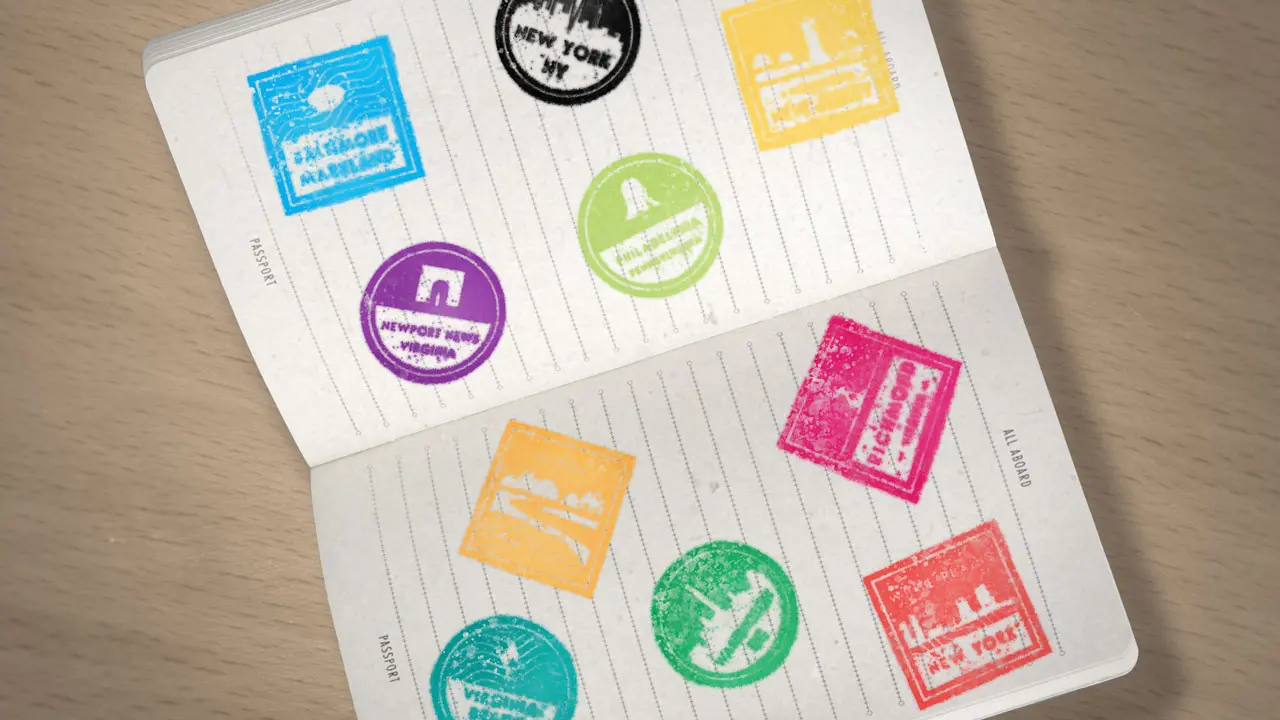
As a unique give away, we designed a physical passport-style notebook for staff to bring to each office they visit. We gave each designated “office ambassador” a rubber stamp as well as an ink pad with their office color so that visiting each office felt like an accomplishment, just like how one might collect international travel passport stamps. Colorful passport pages earned kudos on the firm’s intranet and supported collaboration efforts.
Value-Add
The visual identity protected the conference investment and made the firm's strategic messaging unforgettable.
It’s a massive financial investment to pay for hundreds of staff’s travel and lodging. Leadership wanted their business-critical strategic messaging to stand out not only at the event, but through follow-up messaging.
Now, because their strategic messaging has memorable branding, updates from leadership will ensure staff recall the goals discussed at the conference and make them a business priority.
A relatively small investment in design has ensured that all that money spent for the conference is more than a fun trip, or a temporary morale boost for staff — it advances business goals.
© Stephen Bushey, 2019-2025. Made with Semplice 6 and WordPress